Introducing Program: a view of your whole experimentation program, not just the tests running today.
Most A/B testing tools are very good at one question: how is this test doing right now? That question matters. It just isn't the one that decides whether a CRO program is worth what it costs.
The questions that decide that are slower and harder:
• Are we winning often enough?
• Are we testing fast enough?
• When we find a winner, do we actually ship it?
• Are we getting better at choosing what to test?
Until now, answering them meant exporting results into a spreadsheet and rebuilding the history of your program by hand. Program answers them for you. You'll find it in Pertento under Monitors → Program.
Your program in six numbers
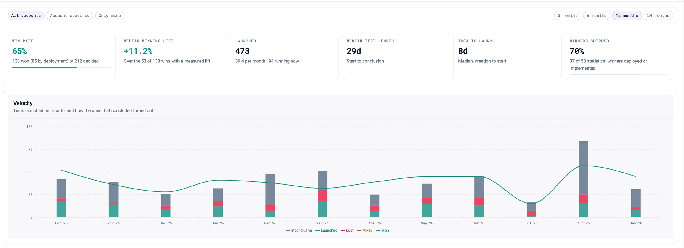
The top of the page is the programme at a glance, over the window you choose (3, 6, 12 or 24 months):
• Win rate: how often your concluded tests produced a winner.
• Median winning lift: how big a typical win is, against control.
• Launched: tests started per month, and how many are running now.
• Median test length: from start to conclusion.
• Idea to launch: how long a test waits between being created and going live.
• Winners shipped: the share of real winners that were rolled out or built in permanently.
The last two are where many programs quietly lose value. A test that waits months to launch, or a winner that never ships, earns you nothing, and neither one shows up in any single experiment report.
Velocity: are you learning, or just testing more?
The velocity chart shows, month by month, how many tests you launched and how the ones that finished turned out: won, lost, mixed, or inconclusive.
Read the two together. A program whose launches climb while its share of wins stays flat is running more tests without learning more from them. A program with steady launches and a growing green share is getting better at picking what to test.
Do your hypotheses predict what wins?
Every Pertento experiment can record its expected mechanism, the reason you think it will work. Reduced friction, improved clarity of the next step, increased trust. Most experiments also carry a PXL importance score from prioritisation.
Program turns those notes into evidence:
• Win rate by expected mechanism shows which kinds of ideas actually work on your site. If "reduced friction" wins twice as often as "increased attention", that belongs in next quarter's roadmap.
• Win rate by PXL importance answers the question every prioritisation framework invites: do the tests we rate highest actually win more often? If they don't, your scoring deserves a second look.
Groups with only a handful of results are shown dimmed rather than hidden. One win out of one test isn't a trend, and the page says so instead of letting it look like one.
How we count a win
A win rate is only useful if you can trust it, so here is exactly how Program counts.
The outcome comes from the same statistics as your experiment report. A test is a win when a variant is confidently better than control and none is confidently worse. It's a loss in the opposite case, mixed when both happen, and inconclusive when nothing is clearly different. "Confidently" means the whole confidence interval sits on one side of zero, with the correction for testing several variants at once already applied.
Inconclusive tests don't dilute your win rate. The win rate is taken over tests that reached a decision. A flat result is still shown in the chart and the list, because knowing an idea did nothing is useful, but it doesn't count against you.
A deployed test counts as a win. Rolling a variant out to everyone is your team deciding it won, and Program respects that decision. Those tests are marked "Won · deployed", and the win-rate tile tells you how many of your wins came that way.
The numbers that would be skewed by that choice use the statistics alone. If "winners shipped" counted deployments as winners, every deployment would be a shipped winner by definition, and the figure could only go up. So it counts only statistical winners. The same goes for the mechanism and PXL breakdowns: otherwise high-importance tests would "win" just because they're the ones people choose to deploy.
Tests that never collected data are left out. With no results there's no evidence either way, so they don't appear on the page at all.
Every account, or just yours
Program uses the same scope controls as Health and Performance:
• All accounts shows your whole program. For agencies, that's every client you manage in one view.
• Account specific narrows it to the account selected in the header.
• Only mine shows the tests you created or started yourself.
Every concluded test is listed at the bottom, newest first, with its outcome, lift, length and sample size. You can filter by outcome, search by name, and open any test for its full report.
Getting started
Program is live for every account now. There's nothing to set up: it reads the experiments you've already run.
Two small habits make it more useful over time:
• Fill in the expected mechanism on each new experiment's hypothesis card. It takes seconds, and it's what powers the mechanism breakdown.
• Score new ideas with PXL before they launch, so you can see whether your prioritisation predicts results.
Open Monitors → Program and see what your testing has been teaching you.